
As extreme drought marched northward from Arizona and New Mexico and parked itself squarely over the Four Corners in early 2018, many turned to one tool to understand the change: the U.S. Drought Monitor.
The map is updated weekly, and it continues to show poor conditions in much of the Southwest.
“Droughts are like the Rodney Dangerfield of hazards. They just don’t get any respect,” said Drought Monitor co-creator Mark Svoboda, director of the National Drought Mitigation Center at The University of Nebraska-Lincoln.
Standing watch for the drought typically happens under the radar. TV crews are quick to cover hurricanes and wildfires. They seldom rush out to stand in front of a desiccated farm field or talk about the federal money set aside for crop losses.
As with many government initiatives, the Drought Monitor got its start after drought struck Washington D.C. 20 years ago. Today the once-obscure resource is used by water planners who decide resource allotments, farmers who need water for their livelihood and federal bureaucrats who it to calculate aid for the Livestock Forage Disaster Program.
Citizen scientists like Dave Kitts outside of Sante Fe, New Mexico are keen to the insights the drought maps provide.
“I think it’s a little obsessive. But I check it every Thursday,” said Kitts, who’s lived on the same 2-acre spread in New Mexico for decades.
He watches the map because he can chart progress on his land. Good wet years mean normal conditions. Dry years crust the soil and kill his pinyon trees.
“It’s just upsetting and depressing to me,” Kitts said. “And when it moves the other direction it definitely lifts my spirits.”
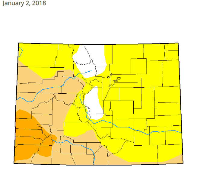
In bad drought years, the map can appear to be yellow, orange and red crayola crayons melted in a haphazard jumble. Each color signifies a level of drought, with deep crimson being the worst. White patches signify normal, moist conditions.
The colorful blobs are intentional, driven by dozens of data points.
Svoboda pointed out they cover everything, “from groundwater, stream flow, [to] temperature.”
Right now all eyes are on the dark red bullseye in Four Corners.
Any weekly adjustments to that bullseye — for better or worse — often take into account input from hundreds of people. It all starts with recommendations from state climatologists on any potential changes.
Assistant Colorado Climatologist Becky Bolinger is personally “feeling a little bit more hopeful“ about recent rain and snow translating into a smaller blotch hovering over the confluence of Colorado, New Mexico, Arizona and Utah.
State recommendations aren’t always based on professional weather watchers. Ranchers and farmers from across the country also send missives to state and national offices.
“We’ve gotten some very specific examples of like, ‘Well, I went out to put in a wood post and the surface was wet and three inches deep the soil was bone dry,’” Bolinger said.
Once recommendations from around the nation arrive, then comes the hard work. Every single national Drought Monitor map is authored by one person who coordinates reports from around the country.

David Simeral, of the Nevada-based Desert Research Institute, is one of those authors. He said the map is “a physically and emotionally draining process,” that starts with data and then he digs into the recommendations. If that sounds like an 8-hour workday, think again. Fortunately, the map author job is rotated between creators every two weeks.
The lines of the Drought Monitor are both a science and art — and a high stakes proposition. Since 2011, the Drought Monitor has triggered $7 billion to ranchers through the Livestock Forage Program.
Each public map has the author’s name printed on it, so Simeral and his peers quickly develop a thick skin. He often finds himself justifying decisions to everyone including politicians who watch federal aid tied to the map, the ranchers who do or don’t receive it and everyday people like Dave Kitts.
He picked up the phone and called the Drought Monitor a few weeks ago after multiple storms moistened the soil on his small ranch. But he didn’t see any changes on the monitor.
Simeral was ready to listen.
“[Kitts] told me it was the most he had seen in the 25 years he had lived in that area,” Simeral said.
So, Simeral wrote down the information and included it in the reams of data for the the following week’s author to review.
Kitts was pleased.
“It even seemed as if my little bit of data was important to [Simeral] and the other authors of the map,” he said.
After that conversation even more rain fell in New Mexico. One week later, when Kitts’ routine brought him back to the drought map, he saw a small improvement for drought classification in his New Mexico county.
There was another change, too: A new appreciation for the Drought Monitor, and the hundreds of people behind it.